CDNで利用する場合は以下のコードをhead部分に記述しましょう。
<script src="https://cdn.tailwindcss.com"></script>文字寄せ(align)
| クラス | プロパティ | ビジュアル |
|---|---|---|
| text-center | text-align: center; | 中央寄せ |
| text-right | text-align: right; | 右寄せ |
| text-left | text-align: left; | 左寄せ |
| text-justify | text-align: justify; | 両端寄せ |
幅
基本的な使い方
| 設定するClass | 適応されるプロパティ | 備考 |
|---|---|---|
| w-1/2 | width: 50%; | 1/2 = 50% の意味 |
| w-1/3 | width: 33.333333%; | w-2/3まで存在 |
| w-1/4 | width: 25%; | w-3/4まで存在 |
| w-1/5 | width: 20%; | w-4/5まで存在 |
| w-1/6 | width: 16.666667%; | w-5/6まで存在 |
| w-1/12 | width: 8.333333%; | w-11/12まで存在 |
| w-full | width: 100%; | |
| w-screen | width: 100vw; | |
| w-[1200px] | width: 1200px; | 好きな幅を指定できる。例)32rem |
好きな幅を指定したい
開発をしているとpxだとかremで直接サイズ指定をしたい時があります。
そんなときも安心です。tailwindではこういったケースにも対応できます
w-[1200px], w-[32rem] のように記載することができます。
同様にmax-w-[1200px] とすると max-width: 1200px; を適用させることが可能です。
レスポンシブ対応
<div class="w-1/2 md:w-full">
    <p>テスト</p>
</div>
上記のように記載することで
横幅が小さい間は画面の1/2の幅(w-1/2)
幅が十分あるときは画面いっぱいに表示する(md:w-full)と設定することができます。
なぜこれでレスポンシブ対応が?
指定したスタイルはclass要素に左記に指定した順に適応されていきます。同じプロパティが指定される場合,後ろに記載したクラスのプロパティが優先されます。
"md:"が付いたプロパティは横幅が768px以上あるときに有効になるという意味があるため,横幅が768px以上あるとき,"w-1/2","w-full"が同時に存在することになり,後に指定されている"w-full"が適用され,「横幅が768px以上ある場合に画面幅いっぱいに表示される」ようになります。
高さ
基本的な使い方
| 設定するClass | 適応されるプロパティ | 備考 |
|---|---|---|
| h-1/2 | height: 50%; | 1/2 = 50% の意味 |
| h-1/3 | height: 33.333333%; | h-2/3まで存在 |
| h-1/4 | height: 25%; | h-3/4まで存在 |
| h-1/5 | height: 20%; | h-4/5まで存在 |
| h-1/6 | height: 16.666667%; | h-5/6まで存在 |
| h-full | height: 100%; | |
| h-screen | height: 100vw; |
レスポンシブ対応
<div class="h-1/2 md:h-full">
    <p>テスト</p>
</div>
上記のように記載することで
横幅が小さい間は画面の1/2の高さ(h-1/2)
幅が十分あるときは画面の高さいっぱいに表示する(md:h-full)と設定することができます。
レスポンシブ対応になっている?
指定したスタイルはclass要素に左記に指定した順に適応されていきます。同じプロパティが指定される場合,後ろに記載したクラスのプロパティが優先されます。
"md:"が付いたプロパティは横幅が768px以上あるときに有効になるという意味があるため,横幅が768px以上あるとき,"h-1/2","h-full"が同時に存在することになり,後に指定されている"h-full"が適用され,「横幅が768px以上ある場合に画面の高さいっぱいに表示される」ようになります。
FlexBox(フレックスボックス)
tailwindcssでflexboxを利用する方法です。
基本的な使い方
<div class="flex">
    <div class="rounded border bg-yellow-500 p-3">1</div>
    <div class="rounded border bg-yellow-500 p-3">2</div>
    <div class="rounded border bg-yellow-500 p-3">3</div>
</div>横方向に右寄せ
横方向に右寄せ(後ろから並べる)場合、「flex-row-reverse」クラスを指定します。
<div class="flex flex-row-reverse">
    <div class="rounded border bg-yellow-500 p-3">1</div>
    <div class="rounded border bg-yellow-500 p-3">2</div>
    <div class="rounded border bg-yellow-500 p-3">3</div>
</div>縦方向にする
要素を縦方向に並べたい場合、「flex-col」クラスを指定します。
<div class="flex flex-col">
    <div class="rounded border bg-yellow-500 p-3">1</div>
    <div class="rounded border bg-yellow-500 p-3">2</div>
    <div class="rounded border bg-yellow-500 p-3">3</div>
</div>縦方向に逆順
縦方向の逆順にしたい場合、「flex-col-reverse」クラスを指定します。
<div class="flex flex-col-reverse">
    <div class="rounded border bg-yellow-500 p-3">1</div>
    <div class="rounded border bg-yellow-500 p-3">2</div>
    <div class="rounded border bg-yellow-500 p-3">3</div>
</div>横幅いっぱいに等間隔
横幅いっぱいに等間隔にするときには通常 flex: 1; を指定しますが、tailwindではclassに「flex-1」クラスを指定します。
<div class="flex">
    <div class="rounded border bg-yellow-500 p-3 flex-1">1</div>
    <div class="rounded border bg-yellow-500 p-3 flex-1">2</div>
    <div class="rounded border bg-yellow-500 p-3 flex-1">3</div>
</div>ちなみに「flex-1」を指定するとflex: 1 1 0%; が指定されます。
レスポンシブ対応を行う
スマホの場合のみflexboxを利用して横方向に並べたい場合はmd:をクラスの前に指定することで対応することができます。
<div class="md:flex">
    <div class="rounded border bg-yellow-500 p-3">1</div>
    <div class="rounded border bg-yellow-500 p-3">2</div>
    <div class="rounded border bg-yellow-500 p-3">3</div>
</div>実際に画面の横幅を変えてみてください。
スマホのような画面幅が小さい場合「flex」は反映されないため、縦方向に通常通り項目が現れます。
PCのような横幅の大きな画面は「flex」が反映され、横方向に現れるようになります。
折り返す
Flexで折り返すようにするには「flex-wrap」クラスを指定します。
<div class="flex flex-wrap">
    <div class="rounded border bg-yellow-500 p-3 w-1/2">1</div>
    <div class="rounded border bg-yellow-500 p-3 w-1/2">2</div>
    <div class="rounded border bg-yellow-500 p-3 w-1/2">3</div>
</div>角丸(rounded)
角を丸くする方法です。設定するクラスによって角の丸さが変わっていることがわかると思います。
rounded
rounded-md
rounded-lg
rounded-full
<div class="rounded その他のクラス"></div>
<div class="rounded-md その他のクラス"></div>
<div class="rounded-lg その他のクラス"></div>
<div class="rounded-full その他のクラス"></div>
その他のプロパティ
それぞれ後ろに「xs」< 「なし」<「md」<「lg」<「xl」<「2xl」<「3xl」の順で丸さを調節できます。
| クラス | プロパティ | ビジュアル |
|---|---|---|
| rounded-none | border-radius: 0px; | |
| rounded-sm | border-radius: 0.125rem; | |
| rounded-t | border-top-left-radius: 0.25rem; border-top-right-radius: 0.25rem; |
|
| rounded-r | border-top-right-radius: 0.25rem; border-bottom-right-radius: 0.25rem; |
|
| rounded-b | border-bottom-right-radius: 0.25rem; border-bottom-left-radius: 0.25rem; |
|
| rounded-l | border-bottom-left-radius: 0.25rem; border-top-left-radius: 0.25rem; |
色
tailwind3.xでは次のような色を使用できます。
それぞれ bg-[色の名前]-[色の濃さ] で表現されていると思ってもらえばいいです。色の濃さは50~900で100単位です。
色の一覧
色の一覧を示します。色の濃さは一律500としています。
| クラス | ビジュアル |
|---|---|
| bg-black | |
| bg-white | |
| bg-slate-500 | |
| bg-gray-500 | |
| bg-zinc-500 | |
| bg-neutral-500 | |
| bg-stone-500 | |
| bg-red-500 | |
| bg-orange-500 | |
| bg-amber-500 | |
| bg-yellow-500 | |
| bg-lime-500 | |
| bg-green-500 | |
| bg-emerald-500 | |
| bg-teal-500 | |
| bg-cyan-500 | |
| bg-sky-500 | |
| bg-blue-500 | |
| bg-indigo-500 | |
| bg-violet-500 | |
| bg-purple-500 | |
| bg-fuchsia-500 | |
| bg-pink-500 | |
| bg-rose-500 |
文字に関するプロパティ
太文字にする方法などを紹介します。
font-weight
| クラス | プロパティ | ビジュアル |
|---|---|---|
| font-thin | font-weight: 100; | すごく細い文字 |
| font-extralight | font-weight: 200; | 細い文字 |
| font-light | font-weight: 300; | 少し細い文字 |
| font-normal | font-weight: 400; | 普通の文字 |
| font-medium | font-weight: 500; | 少し太い文字 |
| font-semibold | font-weight: 600; | やや太い文字 |
| font-bold | font-weight: 700; | 太い文字 |
| font-extrabold | font-weight: 800; | かなり太い文字 |
| font-black | font-weight: 900; | すごく太い文字 |
Border
要素間に適切な枠線を設定する
x方向に対して適切に枠線を設定するには[divide-x]を設定します。
y方向の場合は[divide-y]を設定できます。
<div class="grid grid-cols-3 text-center border divide-x">
    <div>要素1</div>
    <div>要素2</div>
    <div>要素3</div>
</div>特殊なプロパティ
状況によってはimportantで優先的にスタイルをつけたい時があると思います。その際には以下のように記述することができます。
<input type="text" class="!p-0" value="あいうえお" />.\!p-0 {
padding: 0!important;
}
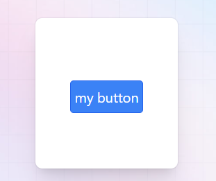
カスタムクラス
様々なクラスが反映されたあなただけのカスタムクラスを作ることも可能です。
例えば、オリジナルのボタンのスタイルを決定する.my-btnを作成してみましょう。
@tailwind base;
@tailwind components;
@tailwind utilities;

@layer components{
    .my-btn{
        @apply rounded text-center border p-1 bg-blue-200 border-blue-600 text-white
    }
}
app.cssを更新した後はnpm run buildを実行して反映しましょう。
<button class="my-btn">my button</button>